
jQuery Mobile 的 CSS 設定說明與重點記錄:以可開闔(collapsible-set)首頁設計為例
|
jQuery Mobile 的 CSS 設定說明與重點記錄:以可開闔(collapsible-set)首頁設計為例
分類標籤: 手機版網頁設計(CSS/Javascript)
|
Moderator March 19, 2012 04:09PM 發表文章數: 1,006 |
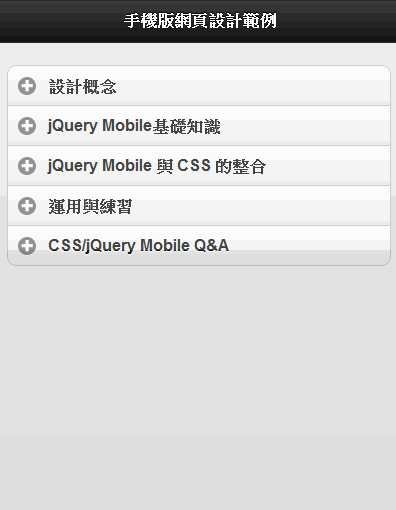
設計目標樣版與設計練習範例:

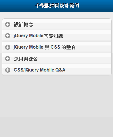
1. 設定 CSS Class:.ui-bar-a
.ui-bar-a {
border: none;
border-bottom: 1px solid #003C64;
background: #0070B8;
background-image: -webkit-gradient(linear,left top,left bottom,color-stop(0, #0071B8),color-stop(1, #004370));
background-image: -webkit-linear-gradient(top, #0071B8 0%, #004370 100%);
background-image: -moz-linear-gradient(top, #0071B8 0%, #004370 100%);
background-image: -ms-linear-gradient(top, #0071B8 0%, #004370 100%);
background-image: -o-linear-gradient(top, #0071B8 0%, #004370 100%);
background-image: linear-gradient(top, #0071B8 0%, #004370 100%);
}
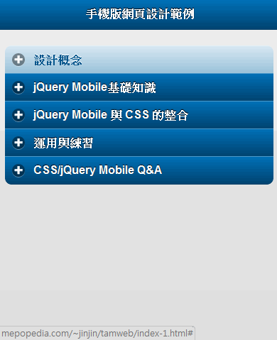
1. 設定「按鈕 / BUTTON」
1. 預設狀態與按下滑鼠時
CSS Class: .ui-btn-up
「ui-btn-up」 設定的是當滑鼠按下後「放開」的當下和之後的狀態。所以一般就是作為頁面初始「一般狀態」的設定。
「u-btn-down」設定的是當滑鼠「按下」的當下的狀態。一般在視覺上會將顏色設定地重一些,或者設定地和「ui-btn-up」一樣。(例如此例中就設定為相同)
上方漸層起始顏色:#0071B8
下方漸層終止顏色:#004370
無漸層時背景顏色:#0070B8
.ui-btn-up-c, .ui-btn-down-c {
        border: none;
        border-bottom: 1px solid #003C64;
        background: #0070B8;
        background-image: -webkit-gradient(linear,left top,left bottom,color-stop(0, #0071B8),color-stop(1, #004370));
        background-image: -webkit-linear-gradient(top, #0071B8 0%, #004370 100%);
        background-image: -moz-linear-gradient(top, #0071B8 0%, #004370 100%);
        background-image: -ms-linear-gradient(top, #0071B8 0%, #004370 100%);
        background-image: -o-linear-gradient(top, #0071B8 0%, #004370 100%);
        background-image: linear-gradient(top, #0071B8 0%, #004370 100%);
}

2. 當滑鼠移至上方時
CSS Class: .ui-btn-hover
.ui-btn-hover-a {
        border: none;
        border-bottom: 1px solid #728fa2;
        background: #d9e9f3;
        color: #005389;
        text-shadow: 0 -1px 1px #FFFFFF;
        background-image: -webkit-gradient(linear,left top,left bottom,color-stop(0, rgb(217,233,243)),color-stop(1, rgb(153,193,217)));
        background-image: -webkit-linear-gradient(top, rgb(217,233,243) 0%, rgb(153,193,217) 100%);
        background-image: -moz-linear-gradient(top, rgb(217,233,243) 0%, rgb(153,193,217) 100%);
        background-image: -ms-linear-gradient(top, rgb(217,233,243) 0%, rgb(153,193,217) 100%);
        background-image: -o-linear-gradient(top, rgb(217,233,243) 0%, rgb(153,193,217) 100%);
        background-image: linear-gradient(top, rgb(217,233,243) 0%, rgb(153,193,217) 100%);
}
2. 調整版型為全幅畫面
方法:在 data-role="content" 的 DIV 中加上 ui-listview 這個 Class。

我們可以發現「加號」和文字的部份有點太擠、太靠左側。因此我們對「加號」的 ICON 和可開闔功能列(collapsible-set)的文字作如下的調整:
.ui-btn-icon-left .ui-icon {
    left: 22px; /* 原本為 10px */
}

.ui-collapsible-heading a .ui-btn-inner {
    padding-left: 52px; /* 原本為 40px */
}

最後,我們再消除 header 部份與 collapsible-set (可開闔) 部份間的空隙:
.ui-collapsible-set {
    margin: 0; /*原本是 margin: 0.5em 0;*/
}

3. 加入自動置中圖片
1. HTML

2. CSS 設定
第一步:讓將圖片置中的 DIV 設定寬度只有 1px。同時,再讓 DIV 自己置中(margin: 0 auto);,並且裡面的圖片(或其他內容)可以自由延伸(overflow: visible)。
.center-image {
        width: 1px;
        overflow: visible;
        margin: 0 auto;
}

第二步:設定完後,再將寬度為 600px 的圖片 (.center-image img),以「一半的寬度」(300px),向左邊移回來 (margin-left: -300px)。
.center-image img {
        margin-left: -300px;
}

3. 解決圖片下方間隙
最後,我們可以發現圖片下方與可開闔功能列 (collapsible set) 之間有一條小間隙。這就是著名的「圖片下方間隙問題」。解決的方法有好幾個,我們這邊採用改變圖片呈現屬性,也就是將圖片設為「display: block;」的方法。
.center-image img {
        margin-left: -300px;
        display: block;
}

如此,圖片的設定就大功告成了。
Edited 5 time(s). Last edit at 03/22/2012 10:17PM by HP.
(編輯記錄)
MEPO forum
is powered by Phorum.