Change History
Message: [作業01] 英文編排探索
Changed By: JinJin
Change Date: March 02, 2010 11:56PM
[作業01] 英文編排探索
Change Date: March 02, 2010 11:56PM
[作業01] 英文編排探索
1.文字編排的準則與方法講義 : http://web.ydu.edu.tw/~httjin/98-2eb.ydu.edu.tw/~jinjin/98-2/typography-1.pdf
作業一:英文編排探索
要素:
1.單字與一段對話:
獨立單一字(點),與至少一行文字(線),並列。
2.每幅作品的尺寸:A4,(也可正方形:如:20X20CM)
3.在完成電腦處理之前需提出至少三張草圖
4.可自行決定使用何種軟體製作。
5.作品完成後,需列出使用哪些要素。
使用的文字可自行決定,也可以使用以下的文字:
S
Type
內文:
Good typography is just as important on a Web page as it is in any other medium. The fact that it appears on a computer screen and not on a piece of paper is immaterial; it should still be pleasing to look at and easy to read.
In every situation where type is used — in publishing, signage, packaging, television, etc. — designers have to adapt their techniques to suit the medium.
進度:
第二週 03/09 文字編排的練習-英文篇 草圖討論
第三週 03/16 英文編排成品製作討論
第四週 03/23 英文編排成品列印
草圖範例:
<a href="http://www.flickr.com/photos/25154658@N05/4397812649/" title="Flickr 上 whc915 的 1-1"><img src="http://farm5.static.flickr.com/4023/4397812649_b3c5e04384_o.jpg" width="590" height="740" alt="1-1" /></a>
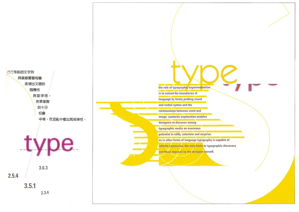
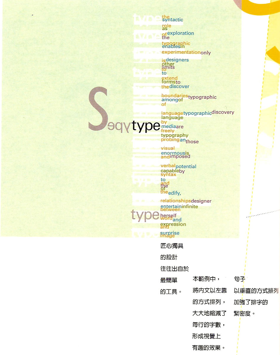
草圖與電子檔對照
<a href="http://www.flickr.com/photos/25154658@N05/4398579318/" title="Flickr 上 whc915 的 1-16"><img src="http://farm5.static.flickr.com/4069/4398579318_3ba71ab8d1_o.jpg" width="1000" height="988" alt="1-16" /></a>
<a href="http://www.flickr.com/photos/25154658@N05/4397812527/" title="Flickr 上 whc915 的 1-3"><img src="http://farm5.static.flickr.com/4064/4397812527_838ddc88d8_o.jpg" width="900" height="665" alt="1-3" /></a>
<a href="http://www.flickr.com/photos/25154658@N05/4397812487/" title="Flickr 上 whc915 的 1-4"><img src="http://farm5.static.flickr.com/4069/4397812487_083fa5c65a_o.jpg" width="1000" height="656" alt="1-4" /></a>
<a href="http://www.flickr.com/photos/25154658@N05/4398579120/" title="Flickr 上 whc915 的 1-7"><img src="http://farm5.static.flickr.com/4072/4398579120_df96574988_o.jpg" width="894" height="574" alt="1-7" /></a>
<a href="http://www.flickr.com/photos/25154658@N05/4397812727/" title="Flickr 上 whc915 的 1-15"><img src="http://farm5.static.flickr.com/4024/4397812727_1d96a5388c_o.jpg" width="1000" height="712" alt="1-15" /></a>
<a href="http://www.flickr.com/photos/25154658@N05/4398579544/" title="Flickr 上 whc915 的 1-13"><img src="http://farm5.static.flickr.com/4005/4398579544_dba4799fcb_o.jpg" width="948" height="1203" alt="1-13" /></a>
完成後請將作品分享於此:
並註明學號
Changed By: JinJin
Change Date: March 01, 2010 11:03PM
[作業01] 英文編排探索
Change Date: March 01, 2010 11:03PM
[作業01] 英文編排探索
1.文字編排的準則與方法講義 : http://web.ydu.edu.tw/~httjineb.ydu.edu.tw/~jinjin/98-2/typography-1.pdf
作業一:英文編排探索
要素:
1.單字與一段對話:
獨立單一字(點),與至少一行文字(線),並列。
2.每幅作品的尺寸:A4,(也可正方形:如:20X20CM)
3.在完成電腦處理之前需提出至少三張草圖
4.可自行決定使用何種軟體製作。
5.作品完成後,需列出使用哪些要素。
使用的文字可自行決定,也可以使用以下的文字:
S
Type
內文:
Good typography is just as important on a Web page as it is in any other medium. The fact that it appears on a computer screen and not on a piece of paper is immaterial; it should still be pleasing to look at and easy to read.
In every situation where type is used — in publishing, signage, packaging, television, etc. — designers have to adapt their technA headline style that works just fine in a magazine spread would not necessarily work on a poster. A magazine is always viewed straight-on at arms length, so letter spacing can be as tight as you like and the words will still be readable. A poster is, more often than not, viewed obliquely, which distorts the type to some extent. Here, a little extra letter spacing helps identification of the individual characters, and hence the words.
Designing for a computer screen has its own set of problems. Add to these the elastic nature of a Web page, which has to work across different computer platforms and screen sizes, and the problems get even worse. It is the designer's job to understand these issues and to address them — to maintain some kind of control when everything else is shifting.
進度:
第二週 03/09 文字編排的練習-英文篇 草圖討論
第三週 03/16 英文編排成品製作討論
第四週 03/23 英文編排成品列印
</a>
草圖與電子檔對照
<a href="http://www.flickr.com/photos/25154658@N05/4398579318/" title="Flickr 上 whc915 的 1-16"><img src="http://farm5.static.flickr.com/4069/4398579318_3ba71ab8d1_o.jpg" width="1000" height="988" alt="1-16" /></a>
<a href="http://www.flickr.com/photos/25154658@N05/4397812527/" title="Flickr 上 whc915 的 1-3"><img src="http://farm5.static.flickr.com/4064/4397812527_838ddc88d8_o.jpg" width="900" height="665" alt="1-3" /></a>
<a href="http://www.flickr.com/photos/25154658@N05/4397812487/" title="Flickr 上 whc915 的 1-4"><img src="http://farm5.static.flickr.com/4069/4397812487_083fa5c65a_o.jpg" width="1000" height="656" alt="1-4" /></a>
<a href="http://www.flickr.com/photos/25154658@N05/4398579120/" title="Flickr 上 whc915 的 1-7"><img src="http://farm5.static.flickr.com/4072/4398579120_df96574988_o.jpg" width="894" height="574" alt="1-7" /></a>
<a href="http://www.flickr.com/photos/25154658@N05/4397812727/" title="Flickr 上 whc915 的 1-15"><img src="http://farm5.static.flickr.com/4024/4397812727_1d96a5388c_o.jpg" width="1000" height="712" alt="1-15" /></a>
<a href="http://www.flickr.com/photos/25154658@N05/4398579544/" title="Flickr 上 whc915 的 1-13"><img src="http://farm5.static.flickr.com/4005/4398579544_dba4799fcb_o.jpg" width="948" height="1203" alt="1-13" /></a>
tp://www.flickr.com/photos/25154658@N05/4397812727/" title="Flickr 上 whc915 的 1-15"><img src="http://farm5.static.flickr.com/4024/4397812727_1d96a5388c_o.jpg" width="1000" height="712" alt="1-15" /></a>
<a href="http://www.flickr.com/photos/25154658@N05/4398579544/" title="Flickr 上 whc915 的 1-13"><img src="http://farm5.static.flickr.com/4005/4398579544_dba4799fcb_o.jpg" width="948" height="1203" alt="1-13" /></a>
完成後請將作品分享於此:
並註明學號
Original Message
作者: JinJinDate: March 01, 2010 10:31PM
[作業01] 英文編排探索
1.文字編排的準則與方法講義 : http://web.ydu.edu.tw/~httjineb.ydu.edu.tw/~jinjin/98-2/typography-1.pdf
作業一:英文編排探索
要素:
1.單字與一段對話:
獨立單一字(點),與至少一行文字(線),並列。
2.每幅作品的尺寸:A4,(也可正方形:如:20X20CM)
3.在完成電腦處理之前需提出至少三張草圖
4.可自行決定使用何種軟體製作。
5.作品完成後,需列出使用哪些要素。
使用的文字可自行決定,也可以使用以下的文字:
S
Type
內文:
Good typography is just as important on a Web page as it is in any other medium. The fact that it appears on a computer screen and not on a piece of paper is immaterial; it should still be pleasing to look at and easy to read.
In every situation where type is used — in publishing, signage, packaging, television, etc. — designers have to adapt their technA headline style that works just fine in a magazine spread would not necessarily work on a poster. A magazine is always viewed straight-on at arms length, so letter spacing can be as tight as you like and the words will still be readable. A poster is, more often than not, viewed obliquely, which distorts the type to some extent. Here, a little extra letter spacing helps identification of the individual characters, and hence the words.
Designing for a computer screen has its own set of problems. Add to these the elastic nature of a Web page, which has to work across different computer platforms and screen sizes, and the problems get even worse. It is the designer's job to understand these issues and to address them — to maintain some kind of control when everything else is shifting.
進度:
第二週 03/09 文字編排的練習-英文篇 草圖討論
第三週 03/16 英文編排成品製作討論
第四週 03/23 英文編排成品列印
tp://www.flickr.com/photos/25154658@N05/4397812727/" title="Flickr 上 whc915 的 1-15">

完成後請將作品分享於此:
並註明學號
作業一:英文編排探索
要素:
1.單字與一段對話:
獨立單一字(點),與至少一行文字(線),並列。
2.每幅作品的尺寸:A4,(也可正方形:如:20X20CM)
3.在完成電腦處理之前需提出至少三張草圖
4.可自行決定使用何種軟體製作。
5.作品完成後,需列出使用哪些要素。
使用的文字可自行決定,也可以使用以下的文字:
S
Type
內文:
Good typography is just as important on a Web page as it is in any other medium. The fact that it appears on a computer screen and not on a piece of paper is immaterial; it should still be pleasing to look at and easy to read.
In every situation where type is used — in publishing, signage, packaging, television, etc. — designers have to adapt their technA headline style that works just fine in a magazine spread would not necessarily work on a poster. A magazine is always viewed straight-on at arms length, so letter spacing can be as tight as you like and the words will still be readable. A poster is, more often than not, viewed obliquely, which distorts the type to some extent. Here, a little extra letter spacing helps identification of the individual characters, and hence the words.
Designing for a computer screen has its own set of problems. Add to these the elastic nature of a Web page, which has to work across different computer platforms and screen sizes, and the problems get even worse. It is the designer's job to understand these issues and to address them — to maintain some kind of control when everything else is shifting.
進度:
第二週 03/09 文字編排的練習-英文篇 草圖討論
第三週 03/16 英文編排成品製作討論
第四週 03/23 英文編排成品列印
tp://www.flickr.com/photos/25154658@N05/4397812727/" title="Flickr 上 whc915 的 1-15">


完成後請將作品分享於此:
並註明學號
MEPO forum
is powered by Phorum.